Blog ·
Responsive web design – why is it so important?
Anyone who has dealt with a new website has surely heard the term responsive design. Behind it lies the ability to adapt the content of your pages to different screen sizes. In today's world of mobile devices, more and more website visitors arrive from a phone or tablet. So the reader needs to feel comfortable even on a small screen, and the pages need to be clear and user-friendly.

Besides responsive design, there is one more way to adapt a website to mobile devices: creating a separate HTML version specifically for mobiles, also called a mobile version of the website. The advantage of responsive design over a mobile version is that only one HTML page is used, which reduces the cost of development and any later changes. Today, however, we will deal only with responsive design.
How does responsive design work?
On responsive websites, the content is arranged in columns. While on a large screen the columns are displayed side by side, when the same page is viewed on a mobile phone they move underneath one another, so that you only need to scroll up or down. For the reader this is much simpler and more natural than having to swipe left or right, or zoom in when the content is too small to read.
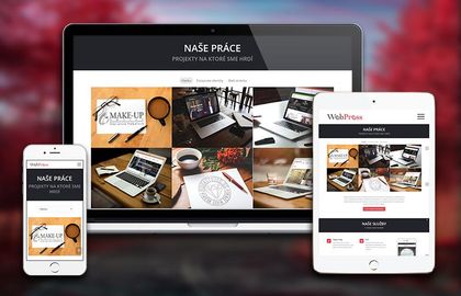
Not all responsive design is created equal
When creating a responsive design, however, it is not enough to simply stack the content vertically. The content of the website has to be fine-tuned as well. Too much unnecessary text and too little empty space can feel chaotic to the reader and discourage them from browsing the site. So you should simplify your text as much as possible, add a few images to make the content easier to understand, and not forget about sufficiently large buttons and other elements, so the reader has no trouble interacting with the page.
It goes without saying that the display on small screens should be simpler than on large ones. For example, leave out unnecessary forms, adverts and further recommended articles. Sometimes it is enough to reduce the number of elements shown: instead of six references, only three are displayed, and so on.
Responsive design has a positive effect on the reader, who stays on the website longer, often clicks through to further sub-pages and, above all, finds what they are looking for in less time. This too can lead to closing a deal or achieving the other goals your website has.
Google likes responsive websites too
Another advantage is your website's position in search engines. Google, Bing and other search engines give preference to websites adapted to mobile devices. A responsive website will therefore rank better than non-responsive sites.
Nowadays a website adapted to mobile devices is a matter of course. It raises an ordinary website a class higher, and browsing on mobile devices becomes simpler and more efficient.
If you want to find out whether your website is responsive, simply shrink your browser window and watch how the elements stack underneath one another. There are several tools for testing this, such as mattkersley.
Every website we build as part of our web development is responsive from the very first design.